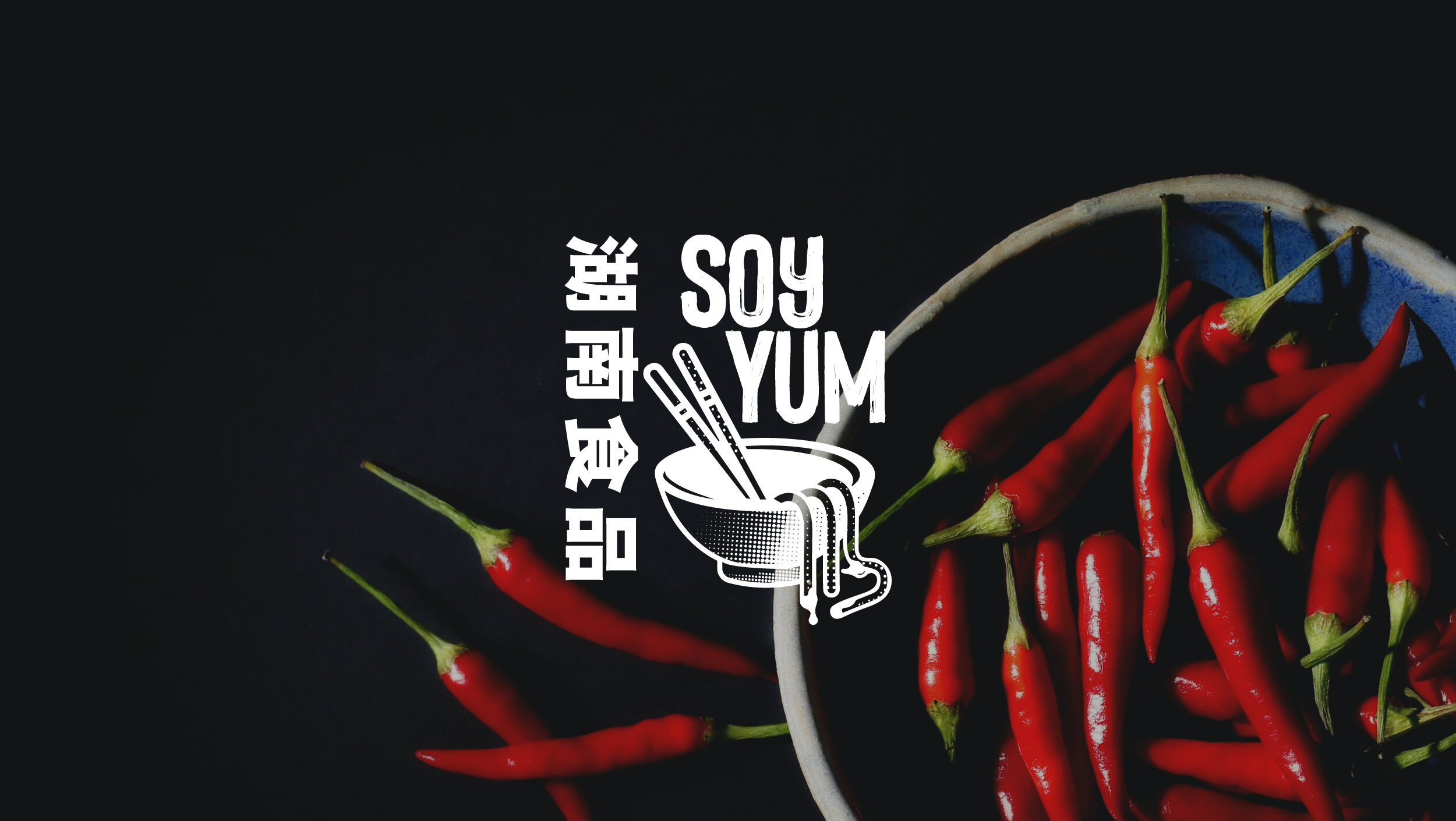
Soy Yum
Project
Soy Yum is an exciting start-up Chinese street food stall that required a brand identity to stand out in a crowded market. The brief was to create a brand to be fun and engage the audience as well as honing in on the authentic heritage. The target market is trendy food markets in London and these potential customers are mainly driven by engaging branding, something that stands out and is fun but still feels genuine.
I delivered a main ID, unique typographic pairings, brand patterns and icons as well as a full suite of materials such as stall livery and menus.
The ID was based on authentic Chinese food stalls in regards to layout, imagery and typography but to bring this to a new western, modern audience I leaned into the stylisation of the illustration as well as adding a bit of fun to the noodles.
Brand identity and logo, printed collateral, positioning and strategy, packaging, web 
The logo
The brief touched on authenticity and heritage, bringing it to a modern western audience. Inspiration came from traditional Chinese restaurants and British Chinese takeaways, but I wanted to modernise it with a fun cartoonish style which matched the name. Soy Yum in itself is a fun name, a play on words of so yum so I had to lean into this fun-ness with the imagery.
The typeset ‘Soy Yum’ is the main ID, a custom-made typeface which has a homemade, raw, authentic feel, and when it’s being used in promotional instances such as clothing, livery packaging etc. the supporting imagery comes into play, the fun noodles, bowl and chopsticks, as well as additional Chinese writing which re-enforces the authenticity, can all be used interchangeably.
Logo development
I explored numerous styles, typefaces and approaches but ultimately I initially presented four routes.


