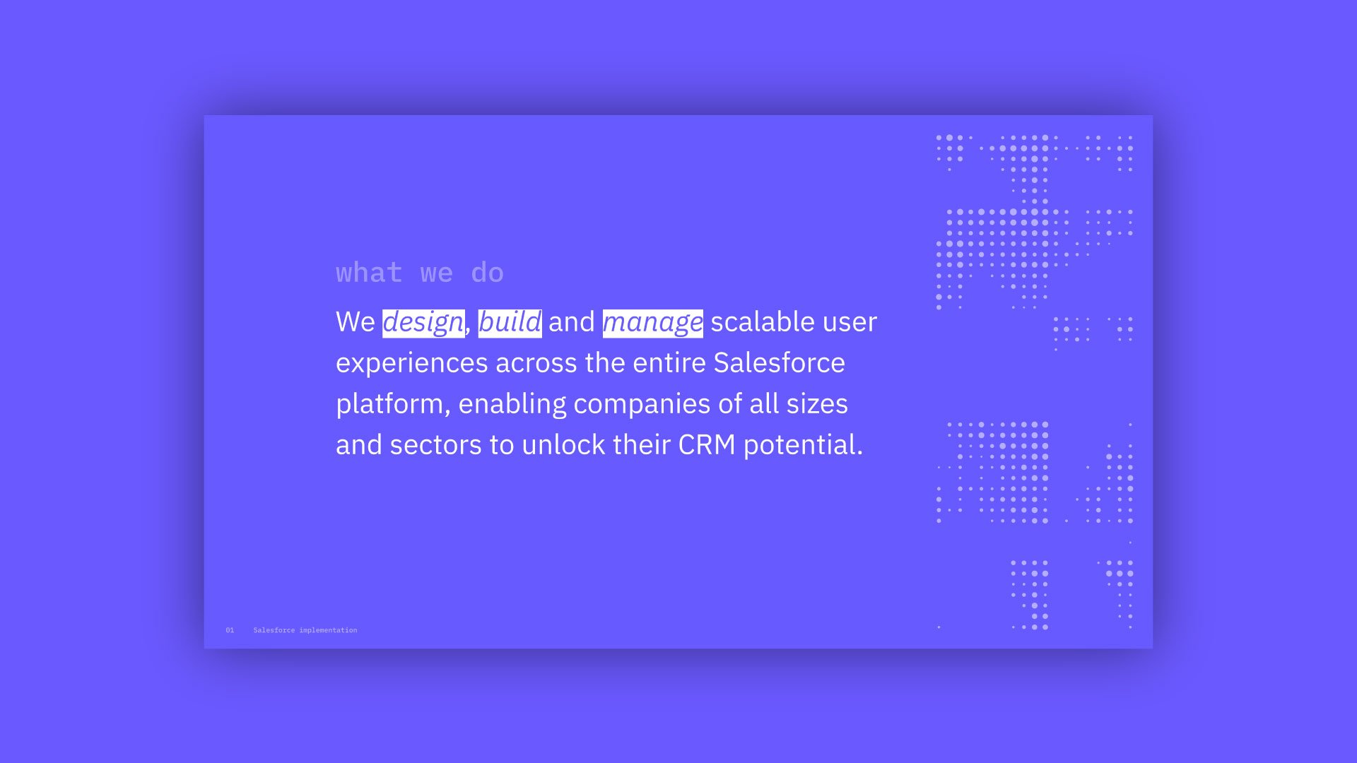
Smart Cloud Consultants brand positioning
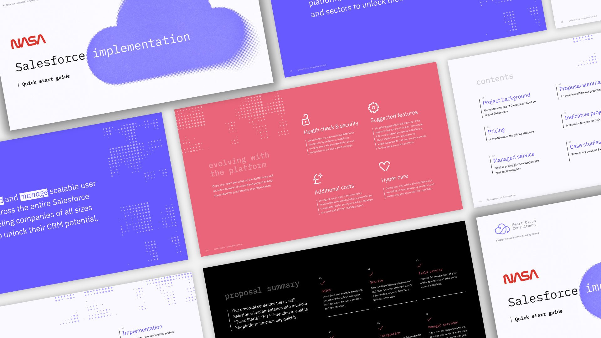
Project
I was briefed to re-brand a tech-based consultancy business in a rather unorthodox manner, as they wanted to dive straight in with an output - a presentation - and wanted to see how their new brand would work in this use case.
This project shows how I tackled this brief, showing visuals of the new brand but primarily trying to communicate the new positioning of the brand, and how the new look and feel would represent that.
Brand positioning, identity, illustration, presentation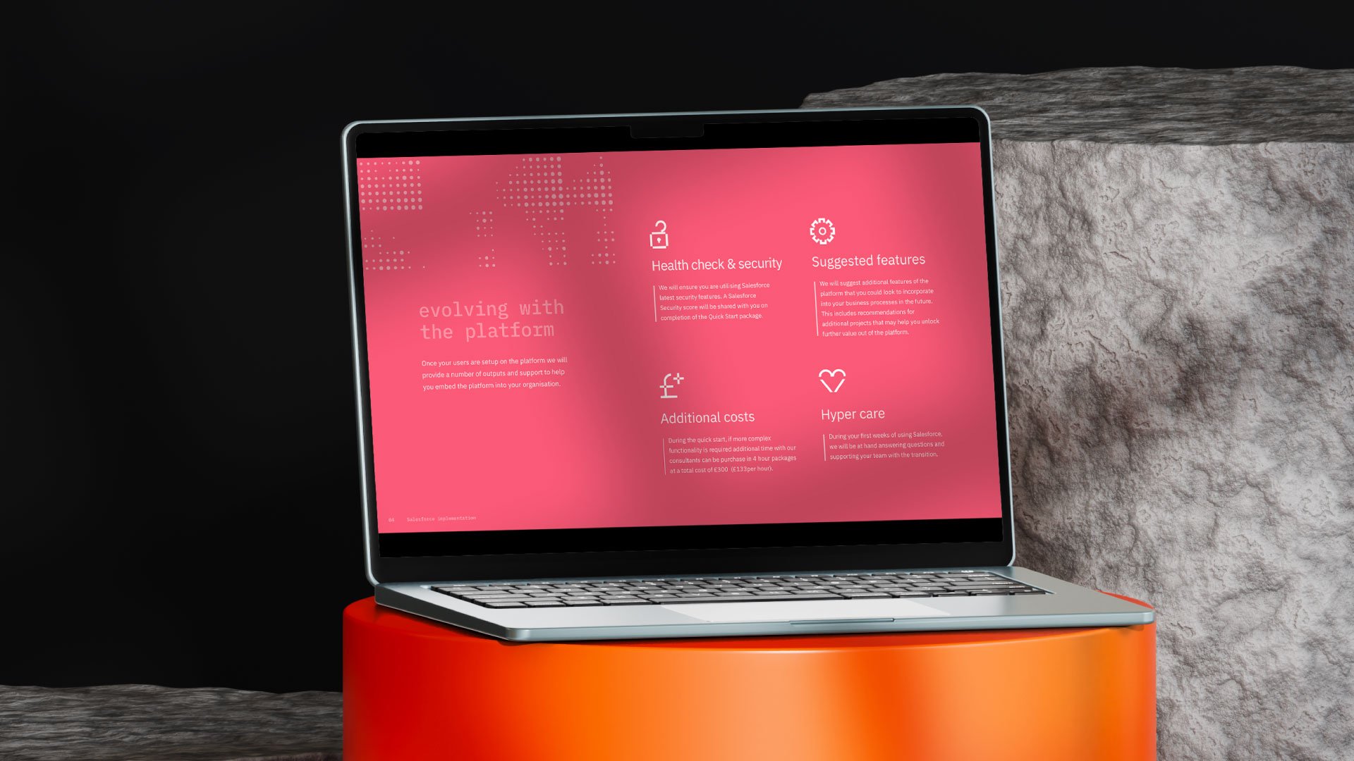
Option one - Speaking to the SME
Bold, confident and friendly
This route is a slight progression on the current brand insofar as it uses elements already established, the connected line work in the logo is brought out in graphic elements in the background, and have developed the colour palette slightly.
Big, bold, oversized typography to show confidence and passion as well as giving the brand its own independent identity. Using a sans-serif typeface makes the brand feel friendly and approachable.
The idea is to not feel like a multi-national corporate company but fresh, switched on, and relevant that anyone will be comfortable working with.


Option two - The Industry Expert
Ultra modern, digital and clean
Monotype is on trend and will be for a while. This route leans into the digital side of the brand, pushing the idea of digital/cloud experts.
This comes through on this slide with the smart typography as well as the halftone cloud, this is to show how imagery can be treated, and the idea behind this is that the halftone effect implies pixels or data blocks.
The colourway on this route is a lot more vivid as opposed to the more muted/pastel colours of route one, which again is leaning into the digital aesthetic.


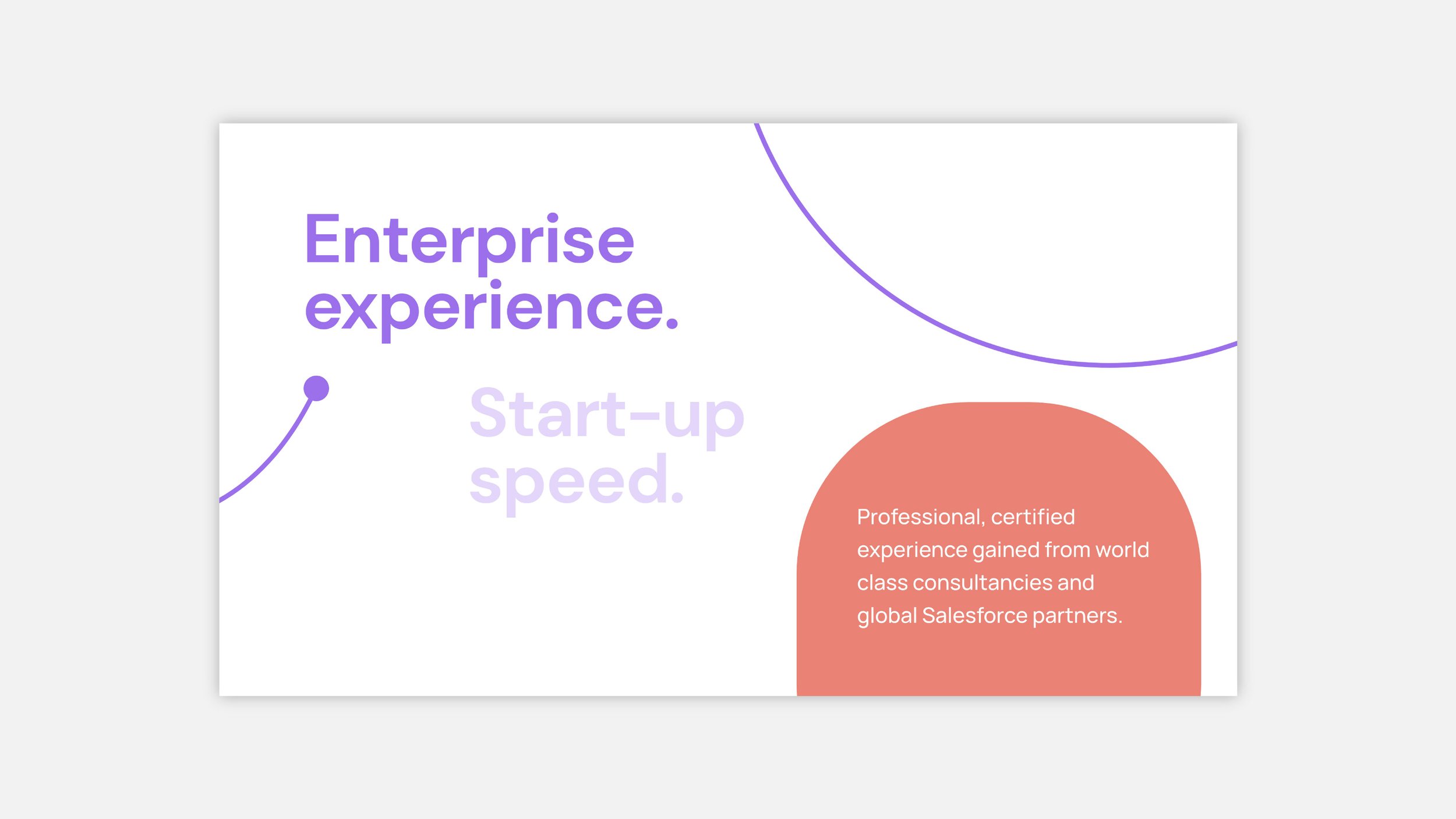
Option two - Professional and slick
Simple, clear and professional
The final route leans more into the cloud aspect rather than the digital side, although we do nod to the digital with the floating data illustrations that tie in with the imagery.
A strong brand element that this route introduces is this ‘frosted’ cloud which can be used throughout, in different shapes and colours, but the background image always being slightly masked.
We use a much more simple graphic styling with simple flat colours, and flat cloud illustrations at the bottom.
This shows how iconography can work, the style brings through the frosted effect to bring the brand together.
Typographically, we use full caps to be bold but tight.


