Sisu Workwear
Project
I was approached to develop a brand identity for a new workwear brand that was aimed at women.
Sisu Workwear is a clothiing brand that is starting out with dungarees for working professionals, DIYers and as a lifestyle brand. The owner is someone who worked in the industry but could never find clothes that suited her, so she started Sisu.
As a brief I was given the name ‘sisu’, and the direction of not to be too feminine, to be strong and cool.
I put forward these three approaches which was the starting point to fully understand where Sisu needed to sit within the industry, with each one leaning into a specific area. Here is the initial proposal which gives a soft touch brand identity for client buy-in, logo development, and the thinking behind each concept.
Brand identity, logo, positioning and messaging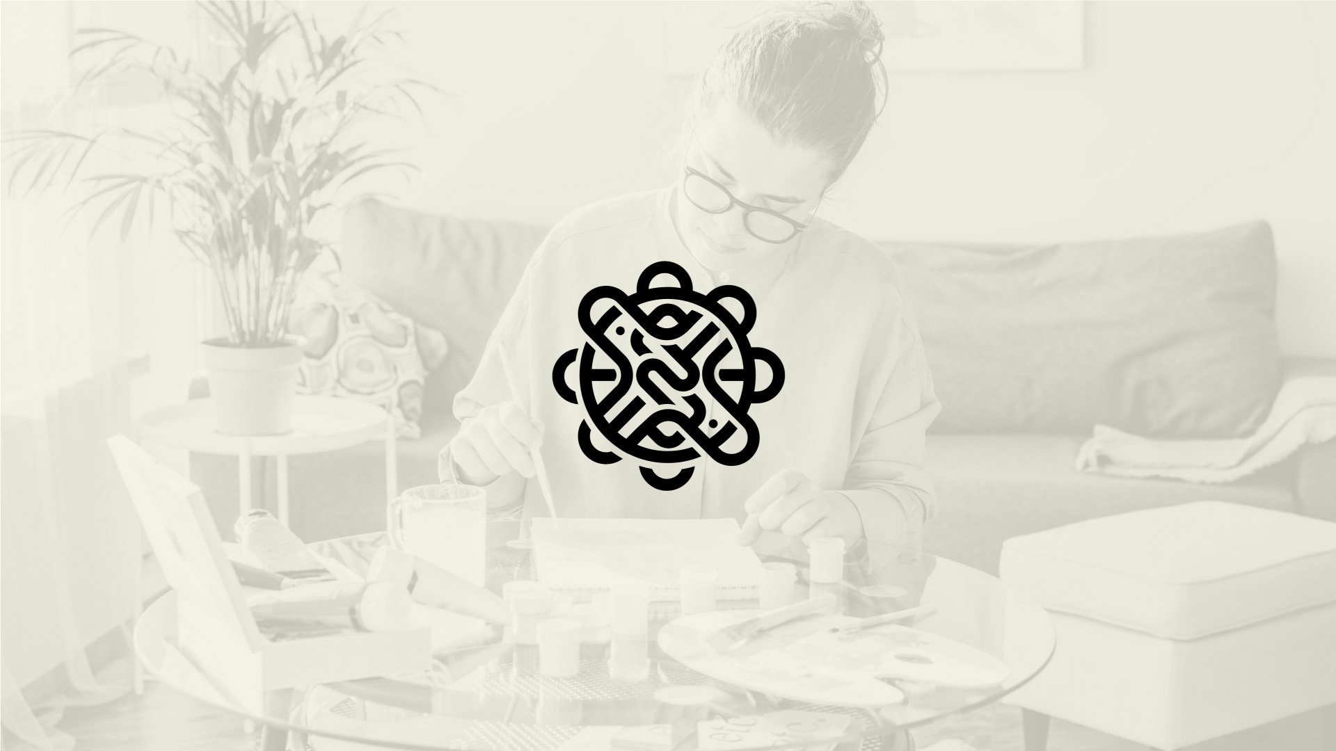
Route one - Strong feminine
Positioning
‘Sisu’ is a Finnish word, and derives from a concept described as ‘stoic determination, tenacity of purpose, grit, bravery, and resilience’ and this reasoning is what ignites this route.
This route positions itself as a strong female-empowered brand, leaning into the Finnish element of the name and using this Scandi style as a brand differentiator, using Nordic symbolism to tie in with the brand name.


Logo development
This ID leans into the meaning behind the word Sisu. Sisu is a Finnish word and the logomarque is a stylised nordic knot. The knot is made up of tangled up Sisu letterforms to ultimately imply a shield of flowers to represent strong women.
The unique typesetting is simple and minimalist to tie in with the nordic/scandi element. The letterforms are perfectly straight to align with the notion that these clothes are designed to fit perfectly.
Additionally, there are colour sections missing within the letters and this is to bring a bit of fun into brand, which rolls out across with the supporting brand patterns. These are nod to paint stripes to bring it back to the original purpose of the clothing.
Under the letter ‘U’ is an underline, first of all to stamp the authority of Sisu being the strong, sturdy foundations for women being able to flourish, as well as subtly emphasising the word ‘sis’ which is one of the reasons you liked this word to represent your brand. It also ties in with the ‘paint blocks’ used as supporting brand assets.


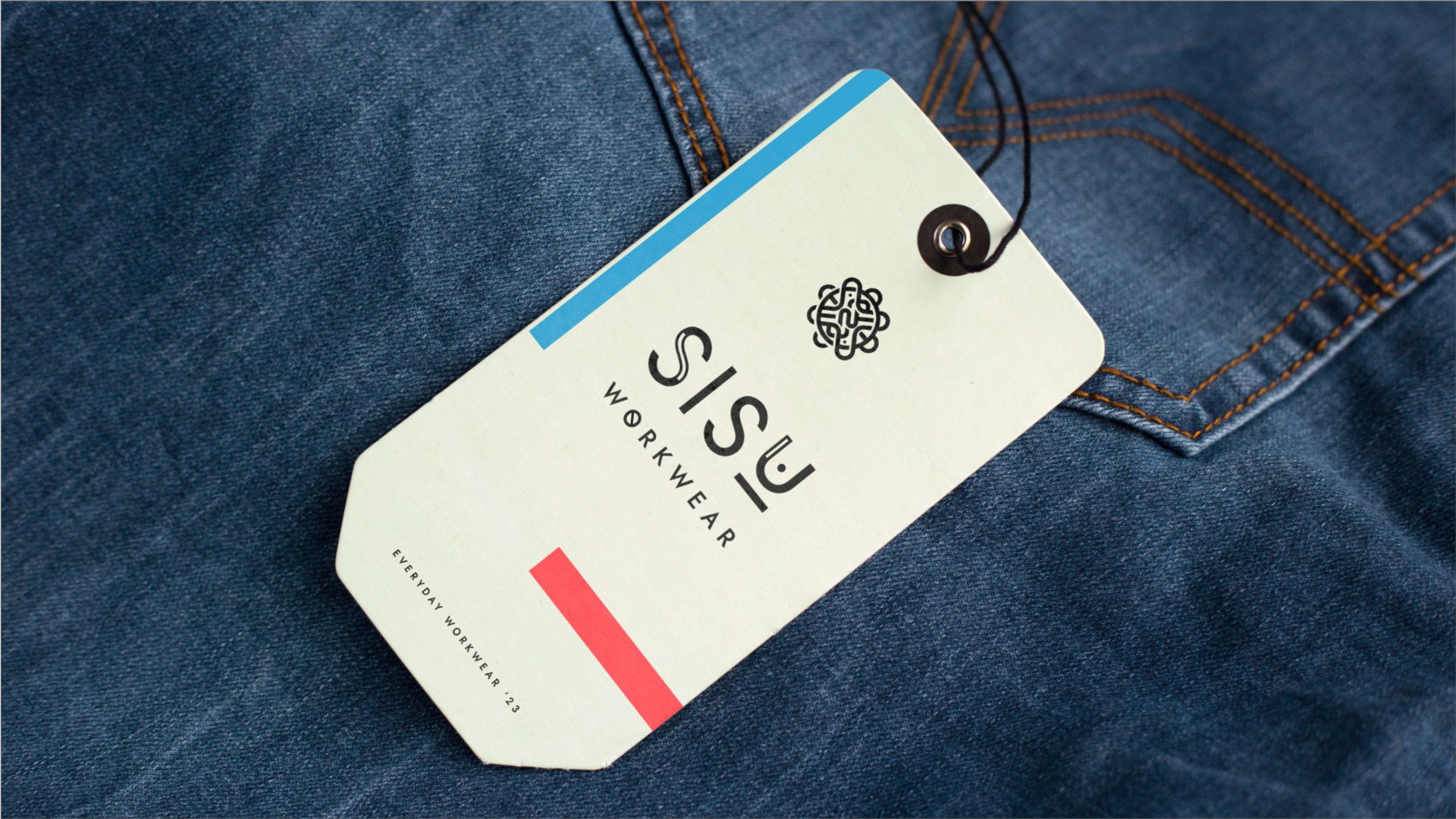

Route two - Workwear
Positioning
Sisu Workwear is a proud industry professional brand to supply suitable clothing for women working in the industry. This route positions Sisu most prominently as an industry specialist that is holistically designed for women to sit directly alongside male counterparts within stores and not look feminine.


Logo development
This ID is more functional, to match the positioning of an industry specialist brand.
It is a unique typographic ID, with tailored intersections of the letter as a subtle nod to the tailoring element of Sisu Workwear being tailored to women.
Additionally, we introduce the supporting circle with the company strapline to imply inclusivity as well as looking like a functional building plan drawing.
The logo marque motif is an abstract amalgamation of the letters of Sisu and stacked in a form to imply a house elevation and building blocks to tie in with the construction element. It is intentionally abstract to not look out of place in industry settings but equally can work outside of this.


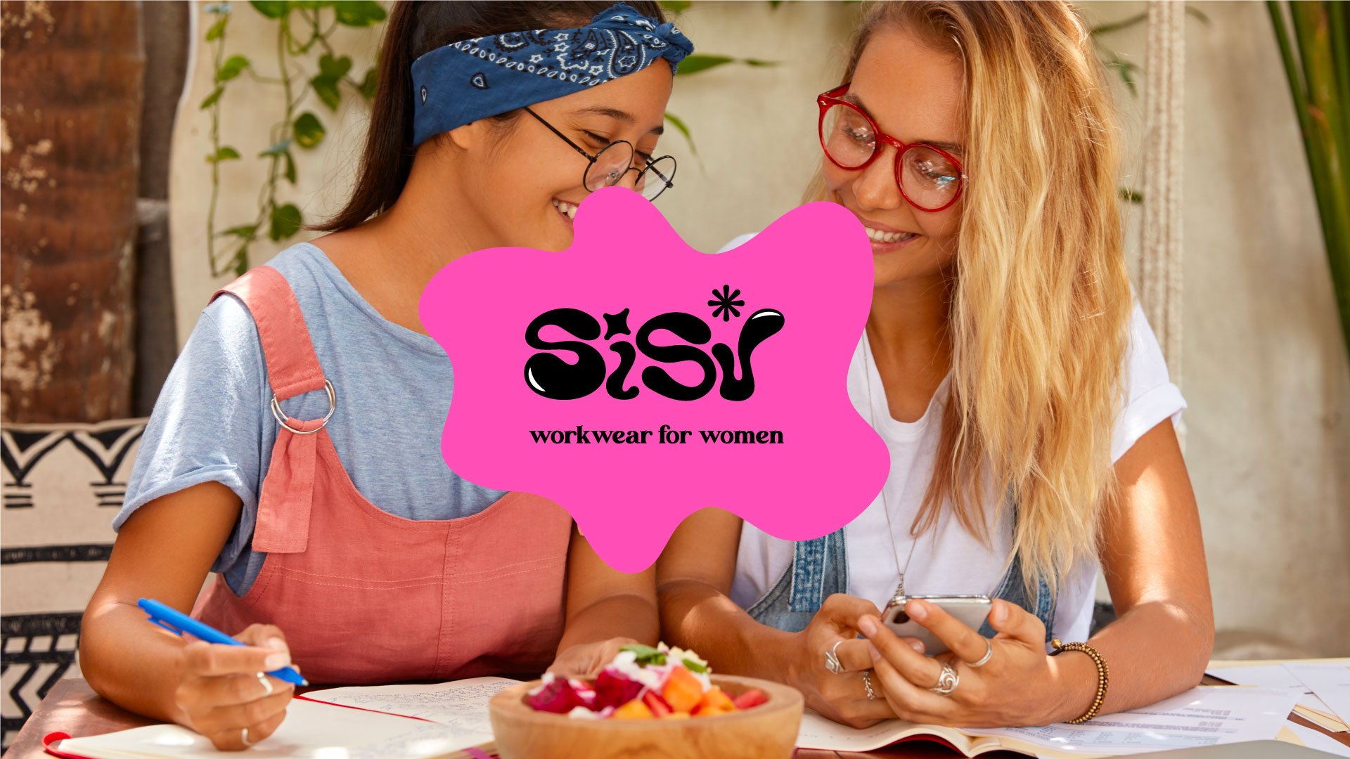
Route three - Lifestyle brand
Positioning
Sisu workwear is a lifestyle brand that derives from professional tradeswear, that is loved by DIY, creatives, and crafters. The clothing is created for work but is premium enough for life.
This route positions Sisu as a playful, fashionable lifestyle brand that is first and foremost comfortable and suitable for women.


Logo development
The unique typographic ID is fun, playful and creative to be engaging and aspirational.
To support the typeset ID are fun shapes, again to add energy and positivity. As well as real world implications of paint and being handmade.
The different size and shaped letterforms is a nod towards all the different fits and sizes that Sisu is designed to overcome. As well as the DIY / lifestyle element that this brand is a home made brand as if it has been created from spilt paint. The shapes are also feminine but brave, which represents the core values of the brand.


