Dubble Audio
Project
An experienced audio design team were stepping out to create a new company and came to me for a brand identity. After competitor analysis and a few working sessions we came to the conclusion to have a simple typeset ID and a supporting mascot. The reasoning behind this was because we wanted to have a simple easily recongisable logo that could be used in professional instances (such as on record label sleeves where their brand isn’t the most importnat) but also to have a fun and friendly brand when used on their materials.
This manifested initially as a developing the ID, mascot and top-level brand identity as well as a website for their initial pitching stages.
The Dubble boys didn’t know where to position their brand so I set out a message house and a tone of voice to really hone down where they sit in the market, and who their customers are / what they want.
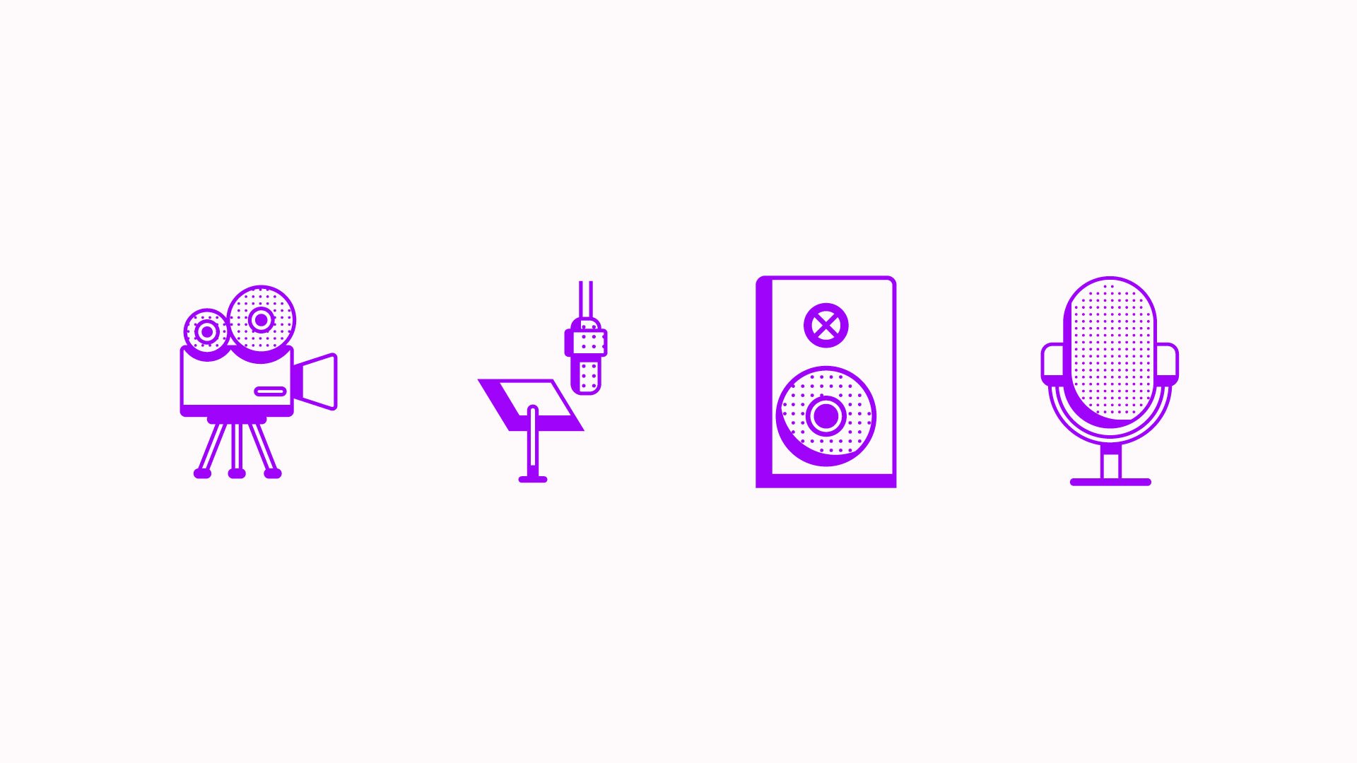
Brand identity and logo, mascot, messaging, positioning and web design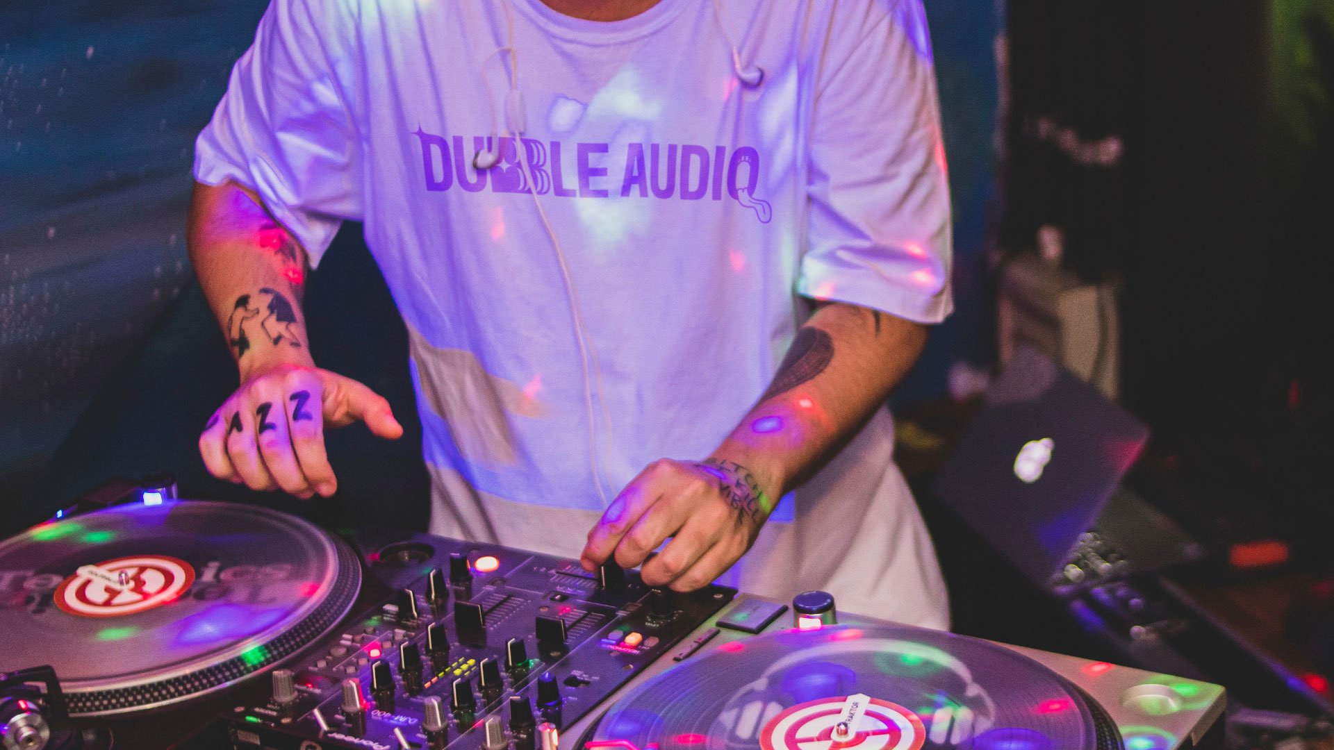
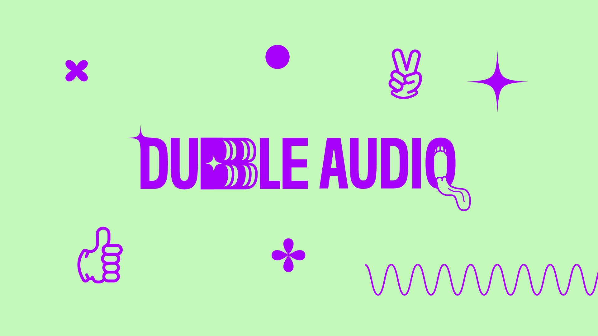
The logo
Although we wanted a clean simple typeset ID I wanted to bring some of their personality through, so I developed a unique typeface with levels of customisation, three version of the logo with different assets. However, the main motif of the ID is double B to be a nod towards the meaning of their company, being two of them they are double.

Mascot
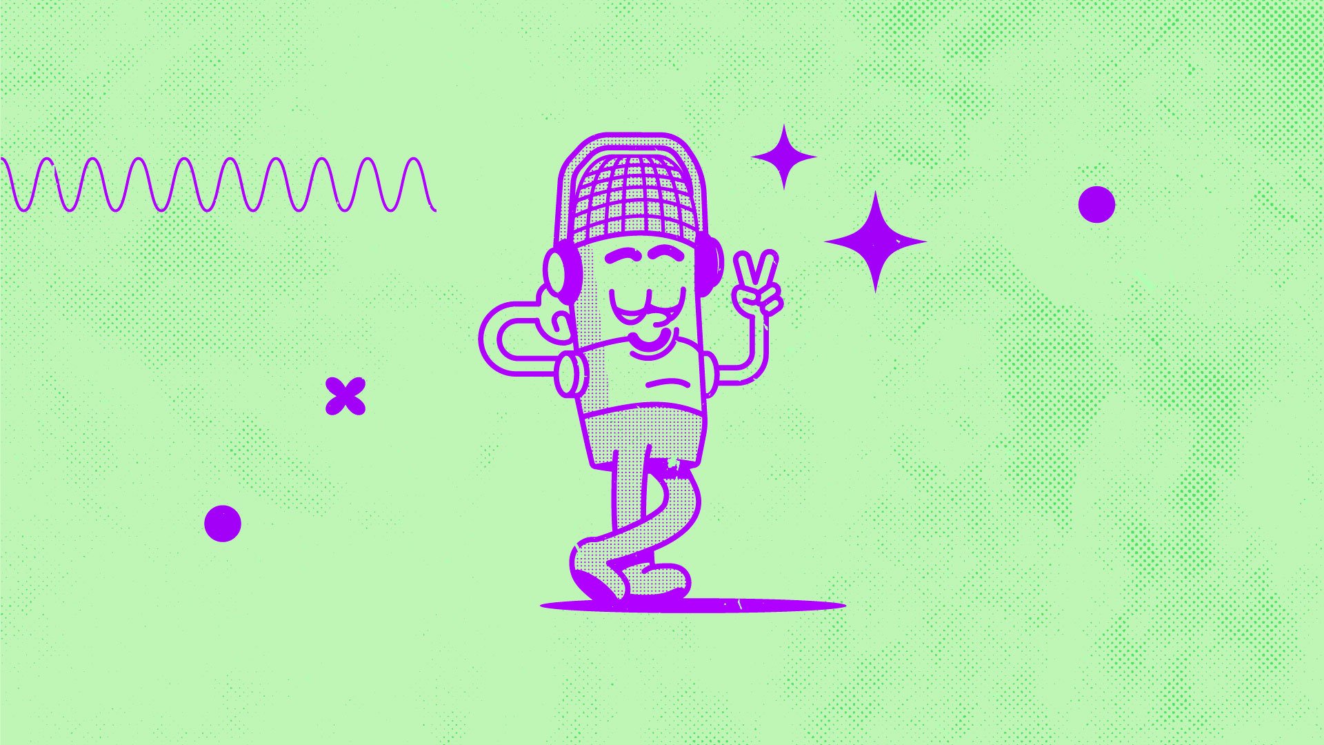
The mascot was the main driving force for the look and feel of the brand, they are a fun and creative duo so I wanted to replicate that in their mascot. An anthropomorphised microphone in a retro cartoon feel, to make the mascot work I needed to give him a bit of personality and this could only be delivered through multiple illustrations in different positions.
The style of the mascot is so strong, that influenced the rest of the branding with a stripped-back colour palette to nod back to riso printed two-tone graphic, bold fun but simple supporting shapes to add personality, and a confident large display type.